
Trading is already a high-pressure activity. The last thing a tool built for it should do is add friction. Not the friction of a difficult decision, but the friction of software that feels dead: a popup you open, a button you click, a text result you parse, a window you close. If the experience of using the tool is slow or flat, people stop using it between setups. And a tool that gets used selectively is not a tool. It is a calculator you check when you already know the answer.
This is why we built the Floor.
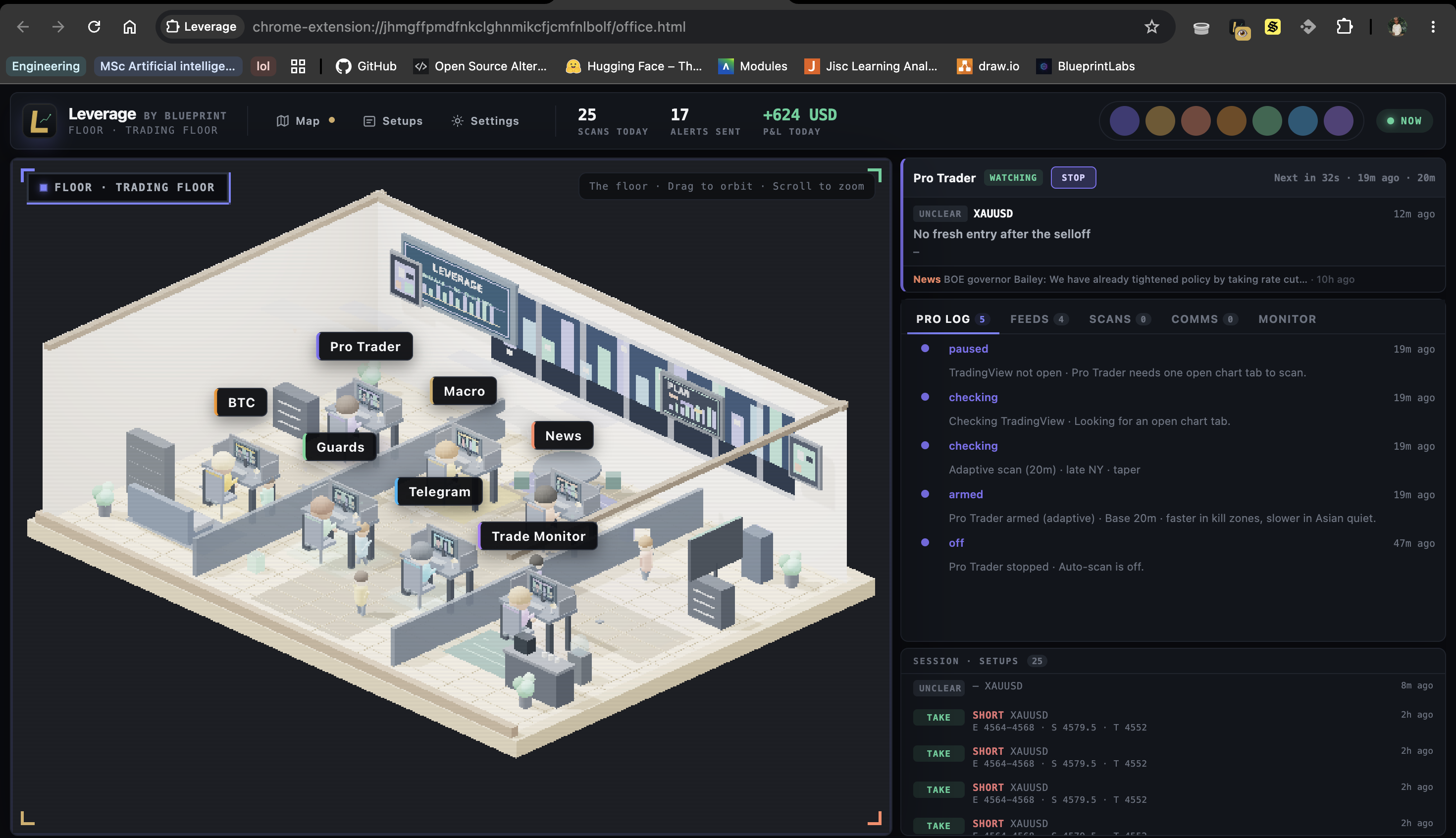
The Floor is the environment you drop into when you open Leverage beyond the popup. It is a 3D isometric view of a trading room, and the agents running inside the system, the chart reader, the macro context layer, the news watcher, the guards layer, the trade monitor, all have a presence in that space. You can watch them. When the Pro Trader system fires a scan, you see it. When a news item arrives that is relevant to your asset, it surfaces. When a trade is active, the room changes state to reflect it.
The instinct when describing this is to call it a gimmick. It is not. Here is why it matters.
When a system is running invisible processes in the background, the user has no feedback loop. They do not know if the system is working, waiting, or stuck. That uncertainty creates a specific kind of anxiety that is not useful in high-stakes domains. You want the user focused on the task at hand, not on whether their tool is functioning. Making the agent activity visible, not as logs or status text but as spatial, animated presence, resolves that anxiety directly. The system is running. You can see it.
The Pro Trader countdown is another version of this. When the next scan is 14 minutes away, the timer is visible in the interface. That is not just information. It is a rhythm. The user knows when the next read is coming and can structure their attention around it. A system that runs on a schedule but does not tell you when creates the opposite: you either check constantly or you miss it.
The stats bar, scans today, alerts sent, P&L tracking, does the same thing. It gives the session a shape. You can see that the system has been running and producing. There is a record of the day's activity that is visible without digging into logs. For a tool that runs in the background for hours at a time, that visibility is the difference between feeling like you are working with something and feeling like you clicked something and hoped for the best.
The notifications are the most direct version of this feedback loop. When a stop or target level is crossed, the notification fires immediately. No polling required on the user's end. The system is watching and it will tell you. That reliability is what makes it possible to step away from the screen without anxiety. You are not the only thing watching the trade.
The gamification framing is useful but slightly wrong. Gamification usually means adding points, progress bars, and rewards to something that would not otherwise be engaging. What we built is different. The Floor and the feedback systems around it are not decorations on top of the actual tool. They are how the tool communicates that it is working. The user's confidence in the system depends on being able to see the system. The design is load-bearing.
The closed beta has been running for a month now. The feedback that comes back most consistently is not about the accuracy of reads, though that comes up too. It is about feel. Users say it does not feel like checking a tool. It feels like having something running with them. That is the version of this we were trying to build.