
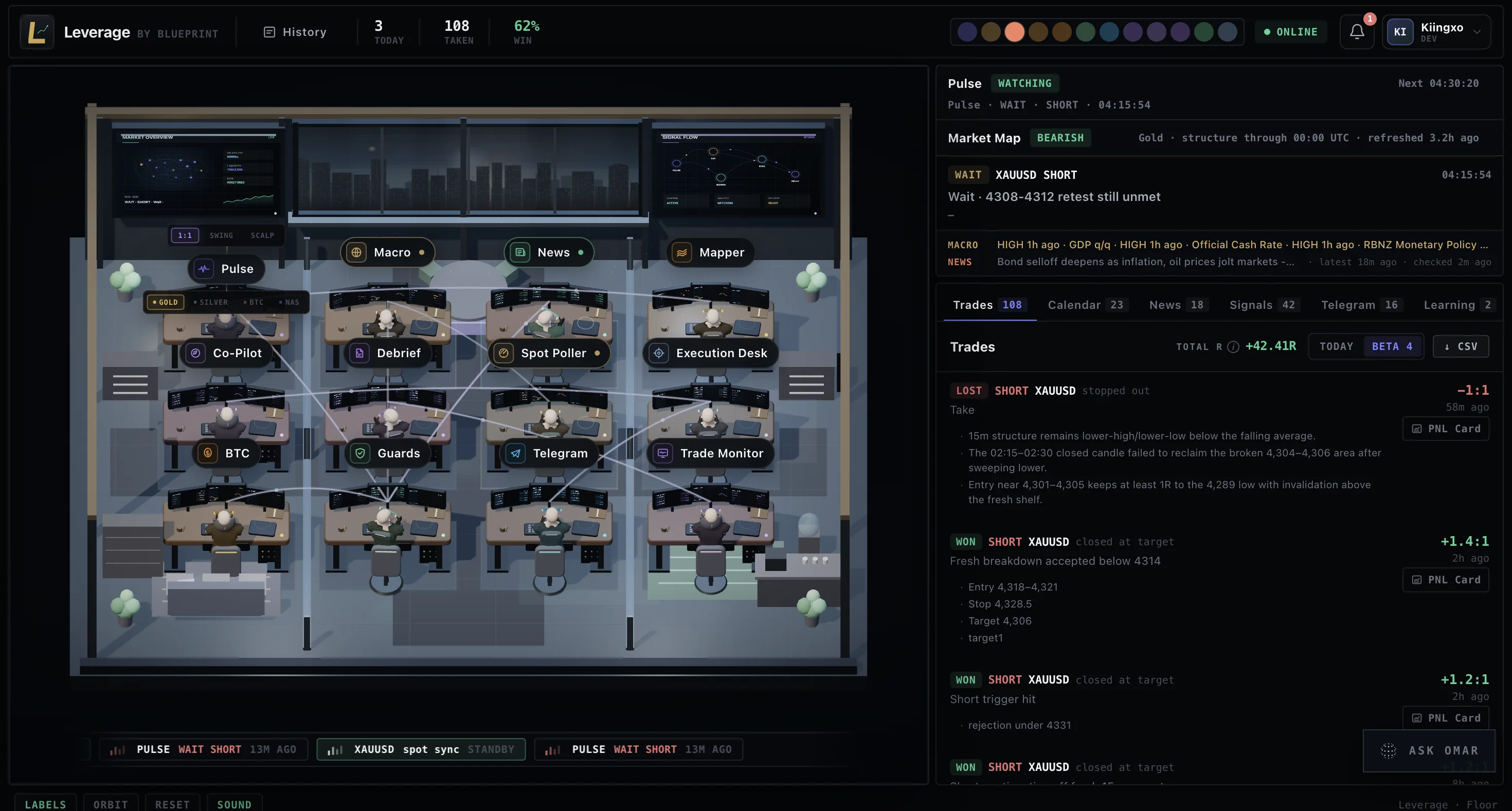
There is something specific that happens when you put an AI tool in front of someone who is actually trying to make money with it in real time. Everything that felt useful in development becomes a liability the moment speed and clarity matter more than comprehensiveness.
Three weeks into daily use, our own sessions plus the first wave of beta users, the Leverage interface had accumulated things that made sense when we built them and did not survive contact with a real session.
A checklist breakdown chip in the verdict banner was showing internal scoring in a format designed for engineers, not users. A set of preset follow-up chips below each read offered four fixed questions, which assumes the user wants to ask one of those four things. In practice they were typing their own questions and the chips were just in the way. A Saved scans list duplicated the Recent activity list and served mostly the same data with a different label.
We cut all of it.
The pattern this surfaces is one that applies to any AI-powered tool, not just trading: the output of a capable AI system can create a false sense of comprehensiveness. If the read is detailed, it is tempting to surface all of that detail. If the system has internal confidence scoring, it is tempting to show that too. But the person using the tool in a real situation is not looking for detail. They are looking for the one or two things they need to act. Everything else is noise at the moment it matters.
The brand color was also a problem. We had used gold throughout the interface, an obvious choice given the core asset. The problem is that gold was also the semantic color for wait verdicts across the whole interface. After a few weeks of daily use the two were visually indistinguishable. The user's eye could not quickly tell whether a warm amber element was a brand surface or a signal state. We moved the brand to indigo. The semantic colors went back to doing their job unambiguously.
The most impactful change was splitting follow-up questions from full re-analysis. This one is worth explaining in detail because it is a general design lesson for AI tools.
When a user asks a follow-up after a read, there are two things they might want. Clarification on the read that already happened, or a completely fresh assessment. These look the same from the input side but they are different tasks. Previously, every follow-up triggered a full new analysis. Asking a quick contextual question would restart the entire process, sometimes returning a different verdict because a few seconds had passed and the chart moved. Inconsistent output on what felt like the same question erodes trust in a system fast.
We split the paths. Follow-up now hits a chat endpoint that reasons within the context of the existing read. The full re-analysis is a separate, explicit action. That change made the system feel coherent rather than restless.
Beta feedback after these changes was direct. The users who run Leverage across multiple sessions every week noticed immediately that the interface had gotten out of their way. That is the signal you are looking for. Not praise for the AI. The feeling that the tool is just fast and reliable and does not need to be managed. That is the standard.